House of Color | Hair Salon
House of Color is a hair salon located in the Bay Area. The owner first began cutting hair in 2016 but grew in popularity through her social media presence on instagram. Since then, she has opened her own storefront, where she now works alongside a few other stylists.
Currently, they rely on their Yelp, Facebook, and Instagram to stay connected with their customers. In order to better reach their clients and to mainstream their business though, I created a website for them where customers can view their services, book an appointment, and more.
Research, User Flows, Information Architecture, Sketching, Wireframing, UI, Prototyping
2 weeks
Responsive website that allows customers to learn about their services and book an appointment online.
Redesign of a logo that would better fit the brand and appeal to their targeted clientele.
Step One: Research
Research Plan, Secondary Research, Competitive Analysis, Provisional Personas, Surveys, and User Interviews
Research Goals
Gain insight on how users typically book appointments.
Identify pain points related to online appointment booking.
Understand what factors influence users when it comes to deciding on a hair salon/stylist.
Competitive Analysis
House of Color is well known for their hair coloring services. There are a few other local competitors who also have a part of that market. As such, I wanted to see how I could make House of Color stand out in comparison. Beyond local competitors, taking a look at well known brands such as Miju Salon also helped show me how I could strengthen my direction with House of Color.

User Interviews
In order to get a deeper insight into what motivates users when it comes to hair salons, I conducted five interviews. I spoke with five people, three females and two males who ranged from their early to late twenties.
I feel like hair is an investment since I don’t
go as often.
- 4/5 users said that they would prefer to book an appointment online.
- 4/5 users mentioned that there is some anxiousness when speaking to stylists, whether about an unsatisfactory cut or explaining what they want.
- 4/5 users initially found their salons from yelp. They were looking at the rating and also number of reviews in total. Photos were also important to them.
- 3/5 users said it was important that the stylist has experience working with their type of hair.
Survey
The survey questions allowed me to understand what is important to people about hair salons, how they first learned about the salon they went to, and their appointment booking habits. One big insight I gained was that many people do not currently book appointments online but a majority would prefer to do so if given the option.
Step Two: Define
User Persona, Empathy Map, Storyboard, HMW, Sitemap, Project Goals, Feature Roadmap, Task Flow, User Flow, and Product Requirements
User Persona
A majority of the clients who visit House of Color currently are millennial females. Keeping that in mind and pairing it with my user interview findings, I created Isabella as the persona.
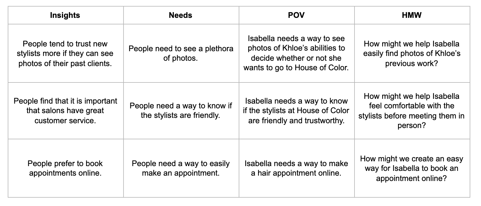
Framing the Question
With a better grasp at user needs, frustrations, and goals, I framed the questions that we were trying to solve.
Sitemap
The survey results showed me that it was important to create the online appointment booking function. However, beyond that, there are other pages that users would expect to see in this type of website.

User Flows
Having confirmed my assumption that online booking will play a key role, it was important that I worked out that flow without any hiccups. I considered all the different information that would need to be taken in order to meet the business and user needs.

Step Three: Design
Wireframes Sketches, Responsive Wireframes, Moodboard, Brand Style Tile, Logo Design, UI Design, and UI Kit
Brand Logo
If you were to look at the House of Color instagram, you would be met with photo after photo of luscious curls in a variety of color. I was inspired by the gentle and soft nature of these photos as I was designing the logo. Bringing in a script font helped emulate that stylish, elegant, and attractive look I was going for.

Brand Style Tile
Pink tones were chosen for the brand. Much of the photos that the salon promotes are hair colors that have warm hues. As such, I wanted to capture the warm and feminine nature of it all.

Responsive Wireframes
In my interviews, I found out that people make appointments both on their phone and also on their computers. As such, I wanted to think about how this website would look responsively. I sketched out and did some wireframes for the various pages that would be part of this site.

Final Design

Step Four: Test
Hi Fidelity Prototype, Usability Testing, and Affinity Map
Usability Testing
View Prototype ➔Test Objective #1: Observe how users navigate through the site and find their objective.
Test Objective #2: See if users can successfully book an appointment.
Test Objective #3: Identify pain points and frustrations in order to improve the flow and design of the prototype.
Part A
Scenario: You’re looking around for a salon to get your hair done. You found House of Color through yelp and are curious to know more.
Task 1: Show me what you would do to get a better understanding and feel for the salon and their stylists.
Part B
Scenario: You want to double check where the store is located so you know how long it will take to get there.
Task 2: Find the location of the store.
Part C
Scenario: You have a question about the ombre balayage service you’re going to get done. You’d like to know how many sessions it would take to go from black to platinum.
Task 3: Where would you go to send the salon your question?
Part D
Scenario: You’ve decided that you’d like to go ahead and book an appointment.
Task 4: Make an appointment where you’ll get your haircut and an ombre balayage done by Khloe N. on August 23.
Affinity Map
All five users complimented the design of the website. They mentioned that it was clean, aesthetic, easy on the eyes, and etc. Of the five users, three of them tried to find more information about the balayage in the services page. They mentioned it would be nice to be able to get more details about the various services that are offered, whether it was a description, price, or images. In addition to that, one user also tried to book an appointment by going to the services page.

Reflection & Next Steps
After taking the user feedback and making revisions to the UI, I would ideally love to have another round of usability testing. It would be great to see how users interact with the revised services page since I revamped it to include more information.
The stylists at the salon also currently offer training sessions and also offer products. These are two avenues that could be implemented into the website. An online store can be added to sell products. Having a page dedicated to training and allowing people to inquire about it could help promote those classes.
Other Projects


